With the use of too much AI-generated visuals, world is flooded with too much perfection in the design industry that now it has started to lose its purpose but due to this something refreshing has started to taking place in 2026. Designers are now giving priority in choosing uneven shapes and lines with the mix of childlike doodles plus scratchy textures and visible “mistakes”
Somewhere between all of this “perfect chaos”, a very interesting movement took birth known as “Organic & Imperfect Design” and its main aim is too look sloppy but with intention. It is actually a war set out against so called “beauty of perfection” and an embrace of a “natural human touch” which is obviously mixed up with honesty and personality.
The reason behind the explosion of Organic & Imperfect Design in 2026
Long time in chasing the clean minimalistic with spotless gradient design elements, the viewers started to experience digital fatigue. The most flawless designs often feel like its empty within or more like lost a very important part inside which it needs to shine, generally when everybody is crazy in using the same AI tools over and over again.
Naive Design successfully starts to counter this problem by embracing:
- Uneven proportions
- Hand-drawn scribbles
- Outlines displaying the rough edges or awkward fills
- Textures with maximum opacity (grain, paper noise, ink bleed etc.)
- Simple childlike elements with the mix of clever intent behind it
This brings back the real human touch vibes. Brands nowadays are using this style to appear more approachable, trustworthy and emotionally connected.
Several reports are confirmed from design communities like Canva and Kittl that 2026 is actually the Year of Imperfect. It’s not only just a trend but more of a response to AI saturation. Clients on the other hand are ready to pay a premium price for the work that feels more authentic and not a copy of another AI boredom.
Key Elements of Organic & Imperfect Design
Here are some of the things which make this style work:
Doodle & Comic-strip lines
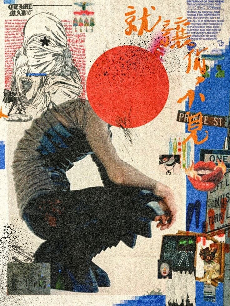
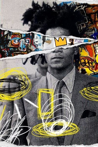
Lines which are not so straight and out of the boundry, granting us with borders which are hand-sketched and crooked shapes plus marker-like strokes which tells us the story that they were drawn with quick motion on paper.
Childlike Illustrations & Naive artstyle
Anything which resembles the charm that lies behind the imperefect proportions like Simple smiley suns, stick figures, crayon textures, flowers with petals which are uneven or maybe characters which are cartoonish by design.
Rough Textures & Tactile Feel
Consider adding grain, subtle noise, paper texture, ink smudges or rough edges. These elements can surely evoke the sensation of physical touch by transforming digital designs.
Asymmetrical and Free-form Layouts
Broken grid with elements overlapping slightly. Letting the composition breathe with imbalance which are playful.
Playful mixed with Bold Typography
Mixing traditional letters with the essence of hand touch as well as clean sans-serif. Serifs which are distored or wonky tends to add personaliity without sacrificing readability.
Limited Color Palettes
Primary crayon colors which are bright and mixed with earthy tones, soft pastels or vibrant dopamine colors.
and the recipe behind this is Balanced Chaos. The display of imperfect good naive design will still communicate the audience clearly and deliver the brand message pretty well.
Real-World Applications
This trend will work beautifully for:
- D2C Packaging & Product Labels: Food brands which are organic, handmade soaps or fashion which contains doodled illustrations and rough textured backkgrounds.
- Social Media Graphics & Reels: Giving a certain kind of relatability in posts and better chances of having an organic engagement which can give a human touch rather than corporate.
- Occasional Cards: Ensures elements which are hand-drawn and more personal with traditional touches (like patterns which are alpana inspired or folks motifs) for Bengali, North-Eastern or pan-India clients.
- Brandings of Cafe & Restaurant: Implementing playful doodles in menu boards, signage and social media posts with elements of naive design like playful doodles can makes the brand feel more welcoming and warm.
We already have a natural advantage among us because in India, our rich tradition already offers aesthetics like folk art, rangoli and handmade crafts which perfectly aligns with naive design art style. Global trends which are imperfect, mixing them up with local culture elements can create unique, standout work that gives totally traditional yet modern vibes.
How to make your design come alive with organic and imperfection?
You don’t require any sets of traditional artistic talent! Let’s dive in!
In Canva (For Beginners)
Use the “draw” tool or Magic studio to create loose sketches.
Then, give some magic to your landscape by adding “texture overlays” like “grain”, “paper texture” or “noise”
and after that, rotate the elements slightly or you can also use “Position” tool to break perfect alignment.
in the end, apply “Duotone” or maybe lower the opacity on few layers to reach that imperfect blend.
In Adobe Illustrator/ Photoshop:
Grab the “Pencil” or “Brush” tool and start drawing (set the smoothness to low)
make sure to choose “scatter brushes” for that unbalanced dots or lines.
to give that certain organic feel, you can also add “noise filter + gaussian blur”
Now scan the real doodles on paper and import them, to make sure you are providing unbeatable authenticity.
Pro Tips for Clean Results:
First of all, begin with a clean structure, then “break it down” intentionally into 2-3 places.
then, try balancing elements which are playful with strong and readable headline.
Experiment testing it on mobile, designs which are “imperfect” by nature often feels more friendly on small screens.
Refrain from doing it too much as the mess will actually turn into “total chaos”.
Tools worth trying in 2026:
Kittl (great naive templates and effects)
Canva’s 2026 ver. Imperfect Design kit
Procreate (for hand-drawn textures)
Texture packs (free) like grain, paper and ink.
Common Mistakes to Avoid:
Making the design look genuinely sloppy instead of giving it that charming imperfection.
Ignoring the hierarchy, goal is to make it playful yet with strong readability.
Implementing too many trends to your design at once (pair naive illustrations with clean text)
Forgetting the message of the brand- imperfection should enhance the purpose of a design, not hiding it!
Victory of Human Design over AI in 2026!
Effeciency can be achieved by “Perfect design” whereas Memorable vibes can be achieved by “Organic and Imperfect design”
As AI tools are getting better at mastering the craft of delivering flawless visuals. The real contender will always be human touch and will definitely not shy away from adding that personality, that warmth… which no algorithm can fully replicate (yet).
For freelance graphic designers in Siliguri, Kolkata or anywhere in India, this is a nice opportunity!
Experiment with this style in your design project, Create your own personal piece with the mixture of naive elements with some local flavor in it and then try to share your process. People love watching “an idea coming alive by human touch”
It’s also important to keep in mind that, the future of design isn’t about competing with AI on the basis of perfection but to embrace those artistic human values which makes us so beautifully imperfect.
Design can be art,
Design can be aesthetics,
Design is so simple, that’s why it is so complicated.
-Paul Rand